4. Unveiling the Art of Magazine Cover Design: What Makes a Standout Cover?
- andrasighiartau
- Mar 18, 2024
- 1 min read
I find the covers of AFAR magazine to be a bit overwhelming due to the complexity and abundance of elements. Simplifying the design could enhance the visual appeal and make it more comfortable for the eyes.

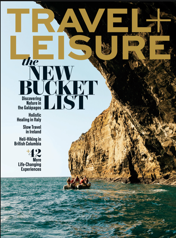
While I appreciate the captivating images featured on Travel + Leisure magazine covers, I find that the text and fonts sometimes overwhelm the visuals, making the overall composition feel cluttered. Simplifying the text and fonts could enhance the balance and appeal of the covers.
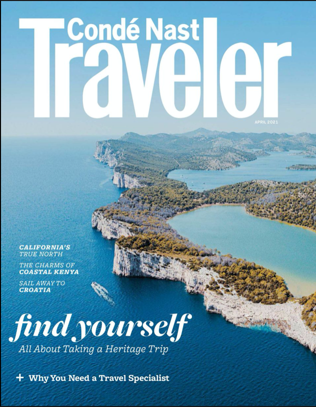
I'm fond of Condé Nast Traveler magazine for its clean and visually appealing covers. The clear text makes it easy to read, and the colors and images are always well-chosen, adding to the overall attractiveness of the magazine.

NATIONAL GEOGRAPHIC:
I admire the captivating split imagery on National Geographic's covers, where one side showcases the sky and the other the land. The choice of fonts and the iconic yellow frame around the logo add to the magazine's enduring charm and visual appeal.


Comments